-
Architects: Zandigan Architects
- Area: 5000 m²
- Year: 2016
-
Photographs:Niloofar Abounoori, Ali Daghigh, Ahmad Saffar, Mohammad Hassan Ettefagh, Sam Iravani
-
Lead Architect: Mohammadreza Nikbakht

Text description provided by the architects. The project is located in one of the main streets of a well-known residential neighborhood with commercial corridors named Pasdaran, located north-east of Tehran. During the design process of this modern commercial building, we have made efforts to choose a middle ground between meeting today's needs of modern offices and benefiting from prior knowledge of design in Iran. This action led us to design an innovative property with an integrated identity. The project is a six-story building with a retail flat and five office floors.


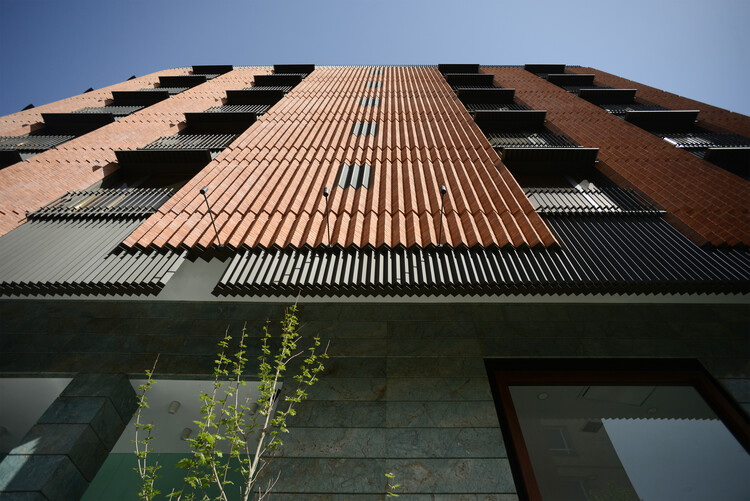
The design inspiration is drawn from historical brickwork decorative patterns and emerged with stylish folded metal panels. Multiple layers of different materials shape the facade's skin. Each of the two major layers separately slides on the building mass to create the facade. The under laid layer is made of folded metal panels cut-outed in the placement of the windows, and the top layer is formed by a zigzag brick pattern with vertical cuts, which makes perpendicular gaps in the position of windows.

The combination of these two layers has created the whole harmonious facade. The zigzag pattern is extracted from brick copings of the historical buildings in Iran. To implement bricks, we used laser-cut metal sheets in the top and bottom of each vertical section of the facade. Then vertical rebars were fixed at regular intervals. In the end, bricks pined to the rebars well aligned.


The composition of materials and the combination of colors are essential parts of our design process; thus, the brick color is accurately chosen as the same color as the famous red brick of the old buildings of Tehran. Metal panels are colored in matte smoky gray to make a modern office look that coordinates well with brick's color. Also, we used a unique local granite stone at the street level, which is directly in the sight of the passing pedestrians and building visitors. At the main entrance, we used wood curved panels with warm colors in harmony with granite stones to make a pleasant welcome to the visitors.


